Monday morning in the admissions office is usually a whirlwind. The admissions team rushes to check on new applicants, incomplete applications, and pending documents. When data is scattered across different spreadsheets and outdated systems, it feels like trying to solve a puzzle with missing pieces. This is why having a certain set of admissions dashboards to start the week off can be very useful. Instead of spending hours hunting for information, this report provides a quick, clear view of what happened over the weekend and what the team needs to prioritize for the rest of the week.
In the past, universities might have waited until the end of a semester to see if recruitment strategies actually worked. Today, things move too fast for that. It is necessary to see the pulse of the campus in real time. Data should not be scary or complicated.
Below are four essential reports every university should see on their morning admissions dashboards.
1. The Admissions Funnel Dashboard
The recruitment team needs to know exactly where prospective students are in the process at all times. A good admissions report shows more than just a list of names. It shows the journey from the very first inquiry all the way to a student paying the enrollment deposit.
When looking at a dashboard on a Monday morning, it is easy to see if a bottleneck exists. For example, if a large group of students started an application but stopped right at the document uploading section, it is a sign that the process might be too confusing or the instructions are not clear. Identifying these small hurdles early allows staff to reach out and help students move forward. This keeps enrollment numbers healthy and ensures the team spends time on the right tasks instead of just guessing who to call next.
Reports to include: Inquiry-to-enrollment conversion rates, stage-by-stage drop-off percentages, average time in stage, offer-to-deposit conversion
What this answers: Where are we losing applicants? Which stage is slowing pipeline performance? How strong is our overall admissions conversion rate?
Actions you can take: Simplify complex steps, adjust communication timing, optimize high drop-off stages, improve offer-to-deposit follow-up
2. Application Progress & Risk Dashboard
Tracking small details in the enrollment process allows for intervention before a small problem becomes a big one. An admissions cycle can slow down quietly. Applications sit incomplete, documents go missing, and high-intent students lose momentum. You can benefit from an application progress dashboard to give the team a real-time view of who is moving forward and who is at risk of dropping out of the process.
Instead of waiting for an applicant to get stuck or give up entirely, the team can send a friendly check-in message on Monday morning to help finish the process. It turns a stressful application process into a supportive experience, which is exactly what today’s students are looking for.
Reports to include: Incomplete applications by stage, missing document tracker, inactive applicants (7–14 days), high-intent prospects without follow-up
What this answers: Who is stuck right now? Which applicants are at risk of dropping off? Where is immediate intervention needed?
Actions you can take: Trigger automated reminders, assign counselors to priority applicants, follow up on missing documents, prioritize near-complete applications

3. Recruitment Source & ROI Dashboard
Not all recruitment channels perform equally. Some generate volume but low conversion, while others bring fewer but highly qualified applicants. A Recruitment Source dashbaord can show exactly where applications are coming from and which efforts are delivering real enrollment value.
This visibility helps admissions and marketing teams align their strategy. Instead of spreading budgets evenly, universities can double down on high-performing regions, campaigns, or agent partnerships.
Reports to include: Applications and enrollments by source, conversion rate by channel, cost per applicant, country/region performance
What this answers: Which channels drive qualified applicants? Are target regions converting? Is marketing spend aligned with results?
Actions you can take: Reallocate budget, refine messaging for underperforming regions, strengthen high-performing partnerships, adjust targeting strategy
4. Enrollment Forecast & Admissions Trends Dashboard
Admissions is not just about today’s numbers, it is about predicting where the intake will land. The Enrollment Forecast & Admissions Trends Dashboard combines real-time deposit data with regional and program-level trends to show whether targets are on track.
It also highlights whether recruitment efforts are attracting students from the intended regions and profiles. If applications are rising in unexpected markets or declining in strategic ones, leadership can adjust before it impacts final enrollment.
Reports to include: Deposit trends vs target, program-level enrollment projections, year-over-year intake comparison, applications by target region
What this answers: Are we on track to hit enrollment goals? Are applicants coming from priority markets? Which programs are over- or under-performing?
Actions you can take: Shift recruitment focus to strategic regions, adjust scholarship allocation, support underperforming programs, refine entry requirements or messaging
Why Visual Data Beats Manual Spreadsheets
The biggest problem with traditional reporting is the time it takes. By the time a manual report is finished, the information is already old. Admissions Dashboards on a strong CRM solve this because they update automatically.
The modern student lifecycle is complex, stretching from the initial lead to enrollment, payments, and beyond. That is where having the right system in place makes a real difference.
Eduhub, built on Salesforce, brings admissions, enrollment, and student data into one connected system so teams can monitor funnel performance, applicant risk, and enrollment forecasts without switching between disconnected tools.
When everyone works from a single source of truth, meetings become shorter and decisions become faster. Instead of fixing spreadsheets, admissions teams can focus on supporting students and hitting enrollment targets. The technology should support the strategy, not slow it down.
Eduhub helps universities set up these systems so that data becomes a helper, not a headache. By connecting all different tools into one place, the institution gets the insights needed without the technical stress. After all, the focus should be on education, not on fixing broken spreadsheets.
Frequently Asked Questions
What is the benefit of a using a dashboard over a monthly report?
A monthly report shows what happened in the past when it is often too late to change the outcome. A regularly updated dashboard shows what is happening right now, so bottlenecks can be fixed and students can be helped before they drop out of the process.
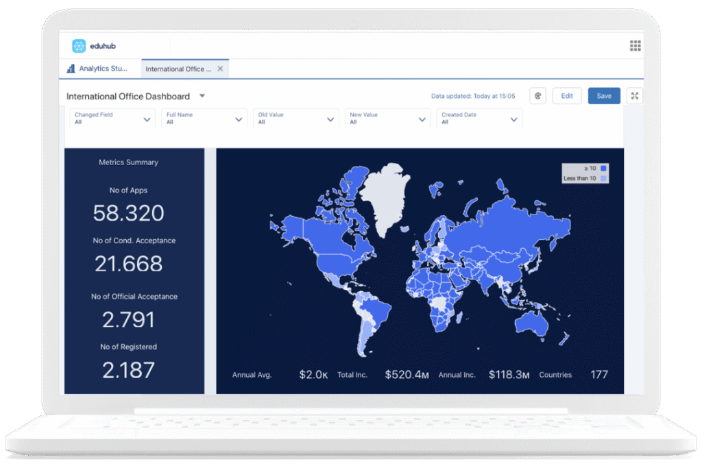
Can dashboards track where international students are coming from?
Yes. Modern dashboards provide geographic insights that show which countries are producing the most applicants and registered students. This helps universities see where their global recruitment efforts are most successful.
How do rejection insights help the admissions team?
By analyzing why applications are rejected, universities can identify if their entry requirements are clear or if they are attracting applicants who are not a good fit for specific programs.
Are these dashboards only for the admissions stage?
No. Effective platforms cover the entire student lifecycle. This includes everything from the initial lead and application to enrollment, tuition payments, student surveys, and even alumni engagement.
Do these tools help reduce administrative stress?
Definitely. When data flows automatically into a visual dashboard, the team no longer has to spend hours on manual data entry or hunting through spreadsheets. This allows staff to focus on high-value tasks like student support and strategic planning.